
Blog
The Psychology of Color in Hotel Interiors and Guest Perception

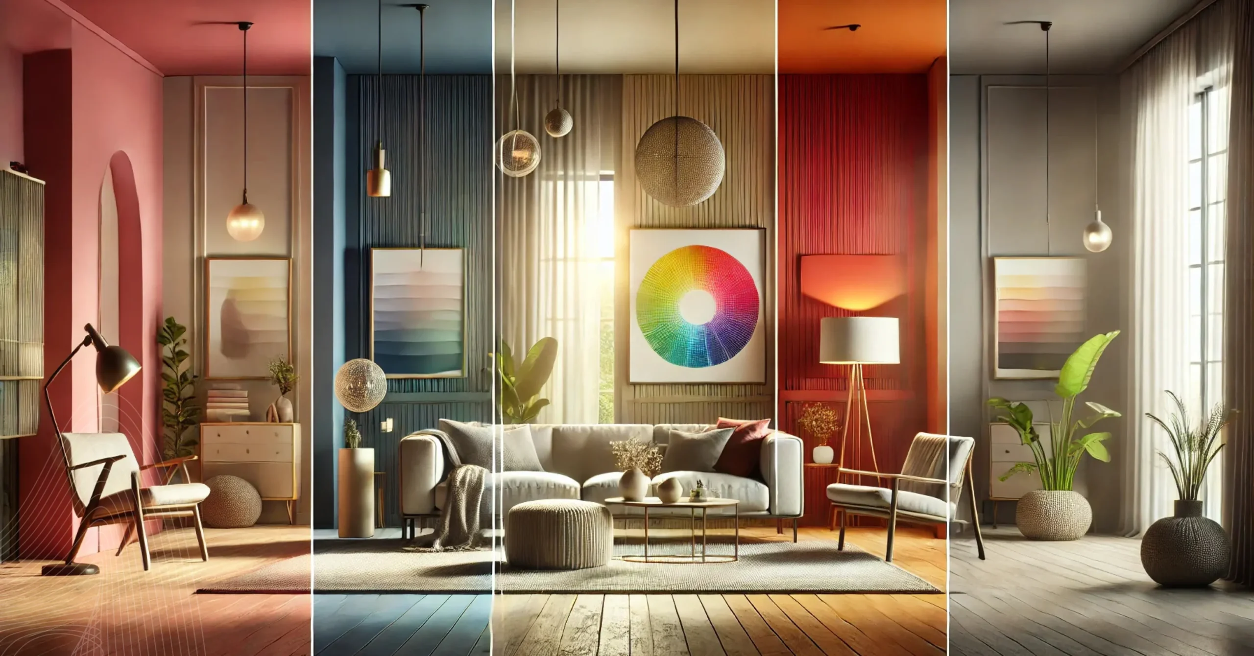
Walk into any well-designed hotel lobby and something shifts before you can name it. Your shoulders relax. Your pace slows. You feel, oddly, at home. That reaction rarely happens by accident. Color is doing most of the heavy lifting, quietly shaping how guests read a space, decide whether they trust it, and whether they want to stay longer than planned.
For procurement managers, property owners, and FF&E buyers across the US, understanding hotel interior color psychology is not a soft skill. It is a sourcing strategy with direct impact on guest ratings, repeat bookings, and the perceived value of every piece of furniture on your floor plan.
Color is Not Decoration. It is Communication.
Most people in the industry know color matters but treat it as a finishing decision rather than a foundational one. That habit is costly, Research in environmental psychology consistently shows that guests form an emotional response to a room within seconds, before they have read a review, spoken with staff, or touched a single surface. That initial read comes almost entirely from visual cues, and color leads the charge.
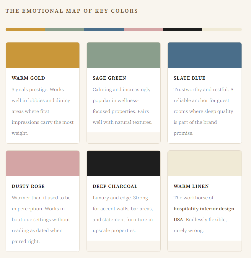
Warm neutrals like terracotta, sand, and dusty rose tend to signal comfort and intimacy. Cool tones in the slate, sage, and navy family communicate calm and reliability. Strong accent colors, when used sparingly, signal luxury by contrast rather than volume. None of this is new science, but the application of it to hotel guest experience design in practice still lags behind what we know theoretically.
“Color does not just tell guests how a space looks. It tells them how they should feel, how much to spend, and whether to come back.”
The Emotional Map of Key Colors – Hotel Interiors
Where Color Decisions Have the Highest Stakes
Not all rooms carry equal psychological weight. The lobby sets the emotional contract. It is the first place a guest decides, consciously or not, whether the stay will live up to what they paid. Properties that treat lobby color as a background choice, rather than a deliberate statement, often see that gap reflected in online reviews that mention “tired” or “generic” without guests being able to say exactly why.
Guest rooms are a different challenge. Here the goal is not excitement, it is resolution. After a long flight or a full day of meetings, travelers need their room to feel settled and private. Overly busy patterns or saturated walls work against that. Muted mid-tones with warm accent lighting tend to perform best in guest satisfaction scores, particularly in the three- and four-star segment where most US properties compete.
Corridors and transitional spaces tend to be underfunded in color planning, which is a missed opportunity. A hallway that feels consistent with the room creates continuity. One that clashes, even mildly, introduces a subtle dissonance that guests may not verbalize but do feel. Cohesion across all touchpoints is a marker of a property that is well-operated, and guests read it that way.
Color and Furniture: They Work Together, Not Separately
One pattern worth calling out for sourcing teams: hotel room color schemes are frequently planned at the design stage and then compromised at the procurement stage. When buyers are working across multiple properties or sourcing at volume, the temptation to standardize finishes for efficiency can flatten the intentional palette work done upstream. That tension is real and worth managing deliberately.
The physical quality and finish of furniture amplifies or undermines a color palette. A warm amber wall reads beautifully against solid wood case goods with a natural oak tone. The same wall with a budget laminate in a competing brown becomes visually muddy. Textiles carry similar stakes. Upholstery weight, sheen, and grain direction all interact with how a color reads under both natural and artificial light throughout the day.
What Operators Get Wrong Most Often
The most common mistake is choosing colors based on how they photograph rather than how they live. Photography favors high contrast and saturated tones. Real guest experience favors balance and comfort over several days. Properties that optimize for their Instagram grid sometimes find that long-stay or return guests feel fatigued by spaces that look better in a camera raw file than they do at 6pm on a Tuesday.
The second issue involves failing to account for light source changes. A color chosen under showroom fluorescents can look entirely different under warm LED downlights, morning window light, and evening ambiance. Seasoned hospitality interior design USA professionals always review samples under the actual lighting conditions of the space before finalizing anything, and sourcing partners who understand this tend to earn longer-term relationships with operators who have been burned before.
Third, and perhaps least obvious, is the cost of not refreshing. Color trends in hospitality move slower than in retail or residential design, but they do move. A property that was thoughtfully specified in 2014 may now read as dated in ways that depress perceived value, even when the physical asset is in excellent condition. Scheduled FF&E refresh cycles tied to color reviews can address this without full renovation budgets.
“Buyers who understand how color interacts with furniture finish and light gain a meaningful advantage in specifying rooms that hold their value over time.”
Sourcing with Color Intention in Mind
For procurement teams working in the US market, the practical translation of all this comes down to three things: palette clarity before sourcing begins, supplier capability to deliver consistent finishes at scale, and a relationship with a hospitality supply partner who understands that color is not an afterthought.
When operators brief vendors with a fully resolved palette rather than a vague category like “neutral and warm,” the result is fewer revision rounds, less returned product, and tighter install timelines. That clarity also makes it easier for suppliers to surface options that are actually right for the project rather than simply available from stock.
When your property is ready to source furniture that holds up to a deliberate color strategy, United Hotel Supply works with hospitality buyers across the country to match FF&E specifications to interior design intent. Whether you are outfitting a boutique property with a distinct color story or standardizing across a multi-property portfolio, the right supply partner makes the difference between a palette that stays coherent and one that quietly falls apart at installation.
